Warm tones create comfort — but cool colors bring clarity.
They calm the mind, expand the room, and make spaces feel fresh and balanced. Whether you’re designing a home office, bedroom, or reading nook, cool palettes are perfect for cultivating peace and focus.
And the best part? With peel & stick wallpaper, it’s effortless to bring that sense of serenity to your walls.
1. The Psychology of Cool Tones
Colors like blue, sage, gray, and muted teal naturally evoke a sense of calm and control. They lower visual “temperature,” slow the eye, and help spaces feel more open.
In color psychology, blues promote concentration and relaxation, while greens restore energy and connection to nature. These tones are ideal for environments where mindfulness or productivity matters.
✨ Think about spaces where you exhale — your office, your bedroom, or even a quiet hallway.
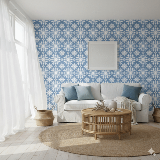
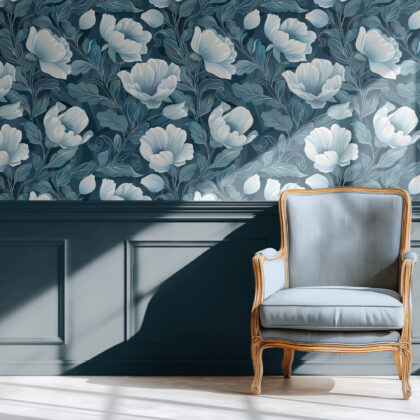
2. Blue: The Color of Clarity
Blue is timeless, grounding, and universally soothing. It works beautifully in rooms that demand focus, like offices or study corners, but also in bedrooms where peace is a priority.
✨ Editor’s pick: Blue and White Moroccan Tile Wallpaper
Design tip: Pair blue walls with white or natural wood furniture to maintain brightness and contrast.
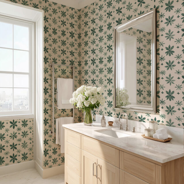
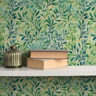
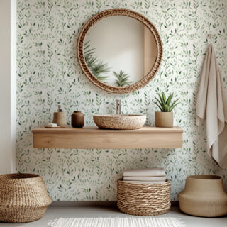
3. Sage & Muted Green: Natural Balance
Green bridges the gap between warm and cool — it’s refreshing yet grounding. Sage and olive tones bring the tranquility of nature indoors without overwhelming the senses.
✨ Try this look: Green Floral Tile Wallpaper
Perfect for creating a calm, cocoon-like atmosphere. The deep green feels sophisticated yet soothing, especially when balanced with linen textures and soft lighting.
4. Gray & Soft Neutrals: The Quiet Foundation
Cool grays, misty whites, and stone tones provide a neutral foundation that pairs effortlessly with bolder accents. They’re perfect for minimalists who crave tranquility but still want depth and visual interest.
✨ Pro styling tip: Add one contrasting texture — like matte ceramics, brushed brass, or woven fabrics — to avoid flatness and bring warmth back into the palette.
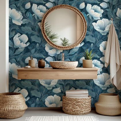
5. Where to Use Cool Colors
- Home office: Encourage focus and mental clarity with blue or sage walls.
- Bedroom: Create calm, restful energy with soft gray-blue tones.
- Bathroom: Use pale mint or light blue to evoke freshness and cleanliness.
- Entryway: Introduce serenity from the first step in.
Even a single wall in a cool hue can recalibrate the entire room’s energy — balancing light, space, and emotion.
Final Thought
Cool tones remind us to slow down. They don’t demand attention — they hold it quietly, creating a backdrop for stillness, creativity, and clarity.
✨ Find your calming shade at ChapterWalls.com and design a space that helps you breathe easier.