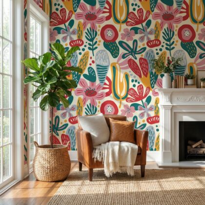
There’s something about warm tones that instantly makes a space feel like home.
They wrap you in comfort, soften sharp edges, and create a glow that feels natural — even when the weather outside doesn’t.
Whether you’re decorating a living room, bedroom, or entryway, warm-toned wallpaper can completely transform the mood. The right palette makes small rooms cozier, open spaces more grounded, and neutral interiors more alive.
Let’s explore how to use these tones to create an atmosphere that feels timelessly welcoming.
Why Warm Colors Work
Warm tones — think terracotta, gold, clay, rust, sand, and olive — echo nature’s most comforting hues. They make interiors feel balanced and lived-in.
Unlike cool colors, which recede, warm colors seem to reach out, inviting you closer. In design psychology, they’re linked to comfort, energy, and emotional connection — perfect for rooms meant for gathering and relaxing.
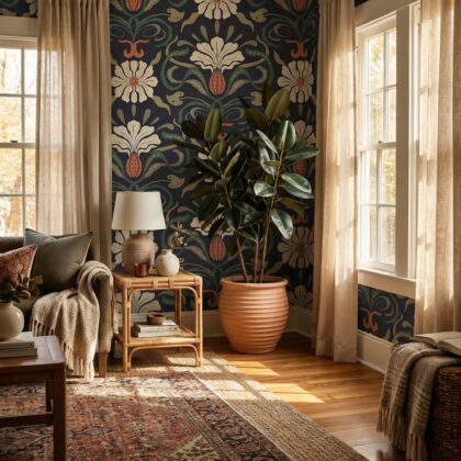
1. Terracotta: Earthy & Timeless
Terracotta is the ultimate cozy neutral. It carries warmth without overwhelming the space and pairs beautifully with natural textures like wood, rattan, and linen.
✨ Perfect pick: Terracotta Moroccan Wallpaper – Geometric Tile
This design combines the handcrafted charm of Mediterranean tiles with a modern terracotta palette — ideal for living rooms, kitchens, or entryways.
You can balance its richness with white walls, jute rugs, and a few greenery accents for an earthy, sunlit look.
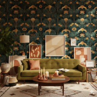
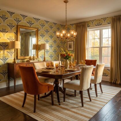
2. Gold Accents: Instant Glow
Gold brings sophistication and warmth at the same time. Whether used subtly in metallic leaf patterns or as part of a bold Art Deco motif, it adds a feeling of light and luxury.
✨ Try the look: Black and Gold Leaf Wallpaper – Luxury Art Deco
3. Beige & Sand: The Foundation of Warm Minimalism
For those who prefer a softer look, beige, sand, and tan bring understated elegance and serenity. These colors provide the perfect foundation for layering warmth with texture.
✨ Best option:Linen Floral Wallpaper – Minimal Botanical Neutral
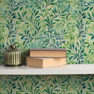
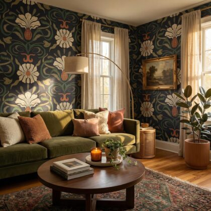
4. Green with a Warm Undertone
Green doesn’t have to be cool. Choose olive, moss, or sage with yellow undertones for a natural warmth that pairs perfectly with wood and gold accents.
✨ Editor’s pick: Green Moroccan Tile Wallpaper – Sage Geometric Mediterranean
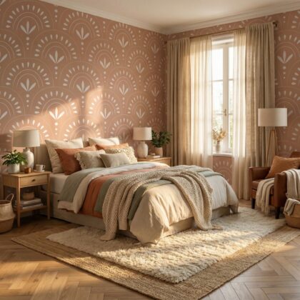
5. Blush & Clay: Soft Warmth for Bedrooms
If you want warmth without intensity, blush and clay tones are your best friends. They’re cozy yet airy — ideal for bedrooms or nurseries where calm energy matters.
✨ Try this one: Pink Leaf Wallpaper – Watercolor Botanical & Floral
Styling Tips for a Cozy Palette
- Mix materials: Combine wallpaper with tactile elements — linen curtains, velvet pillows, natural wood.
- Layer lighting: Warm bulbs + candles + natural light = depth and comfort.
- Keep contrast gentle: Choose patterns that complement rather than compete.
When used intentionally, warm tones don’t just decorate your home — they define its feeling.
Final Thought
A cozy room is more than a design choice — it’s a feeling. Warm tones, when applied through thoughtful wallpaper, bring comfort and emotional resonance that lasts far beyond trends.
✨ Explore the full Collection at Chapter Walls to find your perfect cozy match.